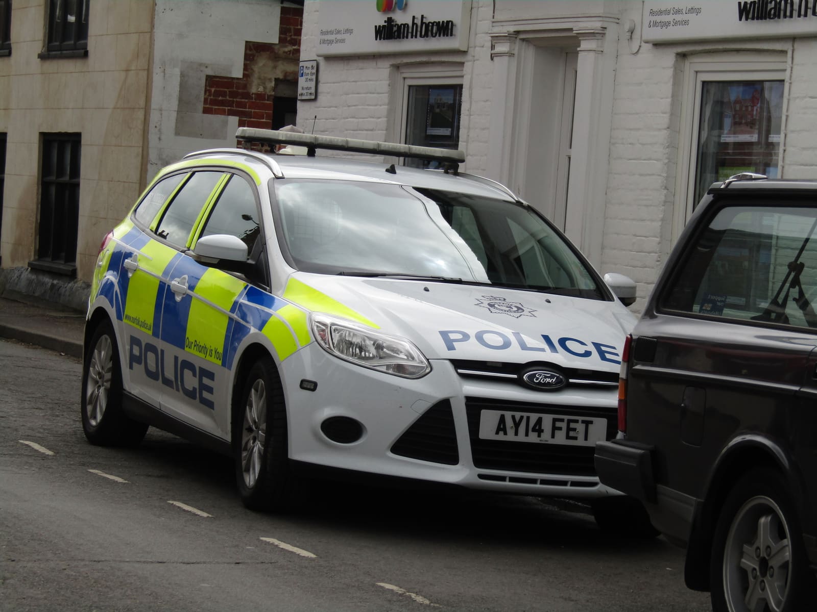
England and Wales publish some of the most detailed open crime data in the world: every recorded crime, by category, by month, mapped to street level on police.uk. Used well, it is a genuinely useful due-diligence tool. Used badly — a single glance at a dot map — it will scare you off perfectly good streets and reassure you about the wrong ones.
This guide is about reading the data the way an analyst would: understanding what is actually being counted, where the distortions are, and which comparisons mean something.
What the data is — and what it is not
The maps on police.uk show police-recorded crime: incidents that were reported to (or discovered by) the police and logged under Home Office counting rules. That is not the same as crime that happened. The Crime Survey for England and Wales — the ONS's large victimisation survey — consistently finds that a large share of crime, in the region of half for many offence types, is never reported to the police at all.
Reporting rates also differ by offence and by place. Vehicle theft is reported almost universally (insurance requires it); minor criminal damage and much anti-social behaviour often is not. So an area with attentive residents and a proactive neighbourhood team can post higher recorded figures than a similar area where people have stopped bothering to report. Recorded crime is a lens, not a census.
Sources: police.uk — crime maps and data · data.police.uk — open data downloads · ONS — crime and justice statistics
The dots are not where you think they are
To protect privacy, police.uk does not plot crimes at real addresses. Each incident is snapped to one of a fixed set of anonymised map points — "on or near Ash Grove" — each of which represents a street or a landmark and must cover a minimum number of postal addresses. A cluster of dots on one corner may simply be that corner's snap point collecting incidents from several surrounding streets.
The practical rule: never judge an individual house by the dot on top of it, and never compare two streets by counting dots. Zoom out, look at the pattern across the whole neighbourhood, and treat any single map point as an area average wearing a misleadingly precise costume.
Category quirks: why town centres always look terrible
Crime concentrates where people and shops concentrate. A retail street posts high figures for shoplifting, theft from the person and night-time violence not because living nearby is dangerous, but because that is where the tills, pubs and crowds are. Shoplifting in particular — which has risen sharply nationally since 2022 — can single-handedly make a postcode with a supermarket look like a crime hotspot.
Read the mix, not just the total. For a residential decision, the categories that matter most are burglary, vehicle crime, criminal damage and violence in residential streets. High "other theft" and shoplifting numbers centred on a retail block are close to irrelevant to how safe your street is at night.
Trends beat snapshots
A single month of data is mostly noise: one prolific offender, one problem address, one police operation can double a small area's numbers. What carries signal is direction over time. Download or chart two to three years of monthly data for the area and ask: is burglary trending down? Did anti-social behaviour spike and then resolve (often a sign the council and police acted), or is it grinding steadily upwards?
Seasonality matters too — burglary typically rises in the darker months, bike theft in summer — so compare like months with like. And when an area shows a genuine sustained rise, look for the story behind it: a new late-licence venue, a change in police recording practice, a single problem property that the council may already be acting on. A change is a prompt for questions, not a verdict.
Be equally sceptical of improvement. A sharp fall in recorded anti-social behaviour sometimes reflects a real fix — and sometimes reflects residents giving up on reporting. The cross-check is the Crime Survey pattern for the wider force area and, best of all, asking people who live there.
Context beats headlines
Raw counts mean nothing without a denominator. Five hundred crimes a year is low for a dense city ward and alarming for a village. Compare rates per resident (or per household) against the force average and against genuinely similar areas — a market town against market towns, not against rural hamlets.
Then add the context no dataset captures:
- Walk the streets you shortlist, in daylight and after dark. Your own unease, or lack of it, is data.
- Ask neighbours and the local neighbourhood policing team (contactable via police.uk) what the real issues are.
- Check the physical tells: shutters on windows, security signage everywhere — or their absence.
- Remember insurance is a useful sanity check: get a contents quote for the exact postcode and see how it compares to your current one.
A 15-minute method for any address
Pulling it together, here is a repeatable routine:
- Open police.uk, find the neighbourhood, and note the last full year's totals by category — ignore the dot positions.
- Split the total into "retail/night-time" categories versus residential ones (burglary, vehicle crime, damage).
- Chart or eyeball 24–36 months of the residential categories: trending down, flat, or up?
- Compare the rate with two or three areas you know well — including where you live now.
- Visit after dark, ask a neighbour, and get an insurance quote for the postcode. Then decide.